I'm excited to share the spread I did for Washington Square, the alumni magazine for San Jose State University. I was contacted about an article they were doing on Moss Landing Marine Labs celebrating their 50th anniversary. The school administers the Masters of Science program for California universities in northern and central California.
I received a brief and worked through some ideas. There was a three week turnaround from when they initially contacted me until the final files were due. I kind of love a short deadline. It makes me a little crazy, but I also power it out and get it done.
They highlighted the areas they wanted me to focus on: vessels and sharks. I love painting boats and at first thought I would just paint some spot illustrations of their different vessels and other marine life.

After researching about Moss Landing Marine Labs, some fun loose sketches. I really liked the way the boats turned out. I love drawing with my paintbrush, without starting with a pencil. I feel like it makes the paintings really fresh. I also tested out a variety of blues to see which shades I might use.

More sketches. As I researched, I was really interested in their Point Sur boat. It has been all over the world, including Antarctica, and I wanted to include the scope of that in the spread. I also wanted to include the Ninja Lanternshark since a student of MLML named Victoria Vasquez discovered and named it. Plus, it's a pretty cool species that looks quite sinister and glows to disguise itself.

I sketched the sign post at Moss Landing. I really wanted to include it, but it just didn't make sense in the final.

As I started to think of ideas, I liked the idea of the illustration being from the ship's bow. The editor and creative director expressed interest in both the article and the issue having a look of deep exploration, to boldly go where no man has gone before, so I thought I could accomplish that by having the reader feel like they were the explorer. You can see above the rough idea of being on a boat and looking at Moss Landing Marine Labs.

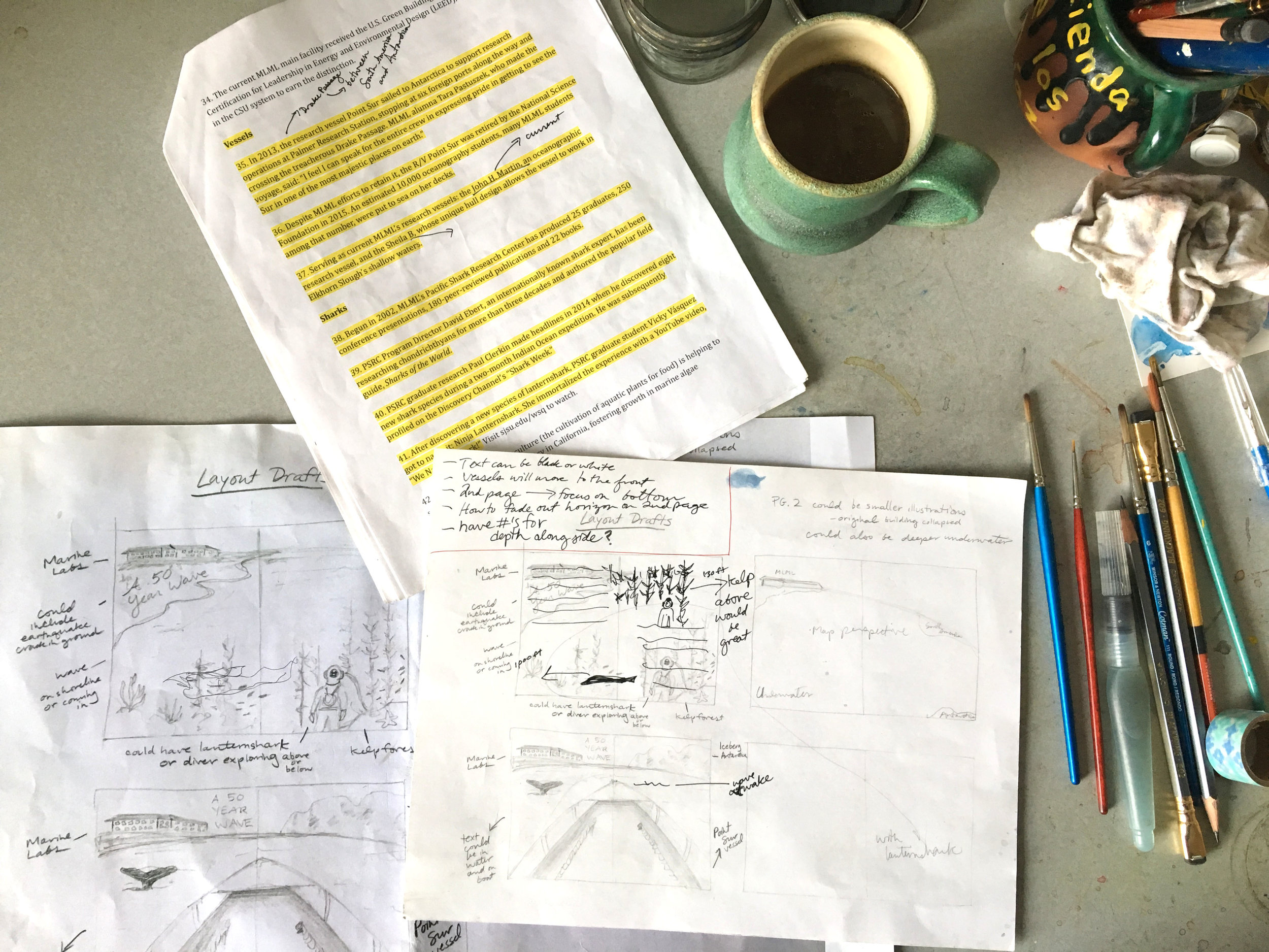
My presentation of imagery for the first draft meeting included a variety of color spot illustrations to show my style and a black and white image to show layout. The loved it, a huge sigh of relief.
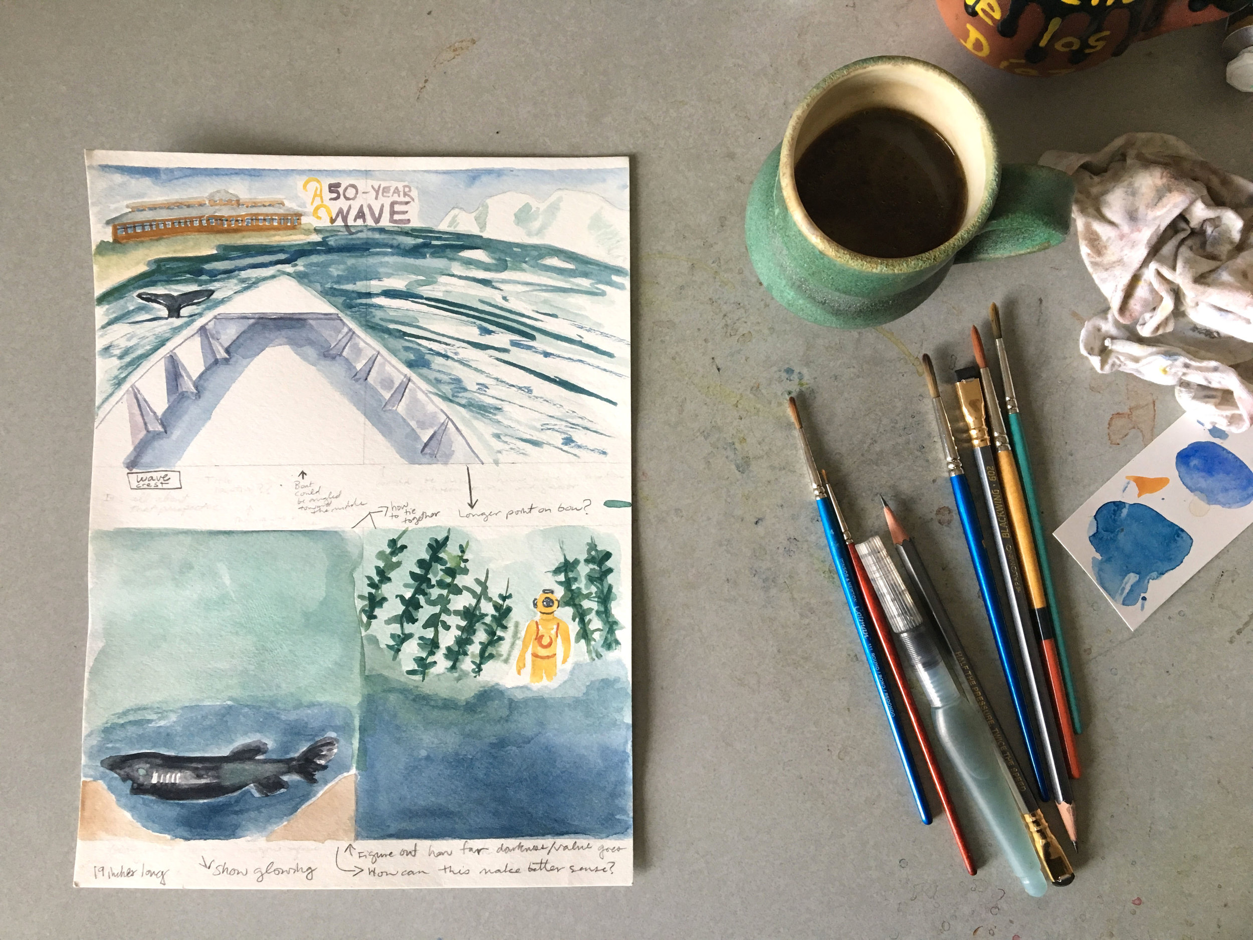
If you look back on the first photo, you can see my original layout draft on the left. They loved the initial two sketches, but asked that the deep sea diver be moved to the second page. They mentioned they wanted the feeling of going wide and deep. I thought being on the boat with Moss Landing on the left and Antarctica on the right would convey that well. The second page of the spread would express going deep with the deep sea diver and the Ninja Lanternshark below. They live at 1,000 feet below, so it worked perfectly.

Here's the second draft. I moved the whale tail to the right, since it was too close to shore in the first draft. It was great to get really positive feedback from the staff and creative director.
One of the biggest challenges was making sure there was enough space for the text of all 50 facts. I kept wanting to take over the paper and make it a whole painting.

The creative director asked me to illustrate the title and the numbers for the spread. I cut out the words and played around with different layouts and angles of text. I ended up scanning the letters and numbers and cleaning them up in Photoshop and then they were vectorized in Illustrator.
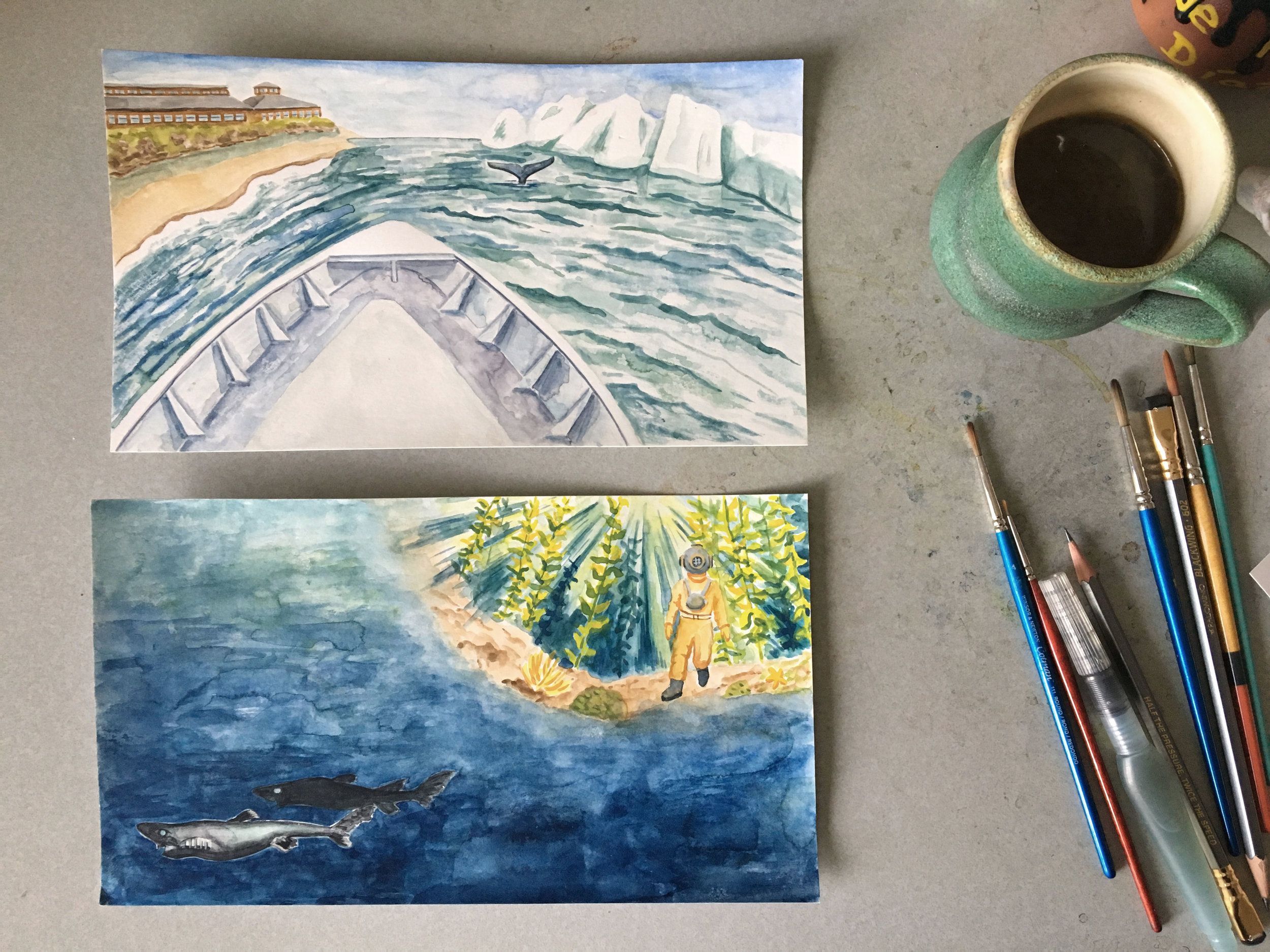
These are the final paintings that were used. I think some of the colors surprised me. The kelp is a brighter green than I thought it would be, but I think it works since it does glow when the sun shines through it from above.

In addition to the Moss Landing article, they asked me to illustrate their donor envelope. SJSU has a program where dogs....This is the final. I sketched it quickly once in my sketchbook and then this is the final, which of course got scanned and cleaned up. The great thing about illustration work is that your "finals" can look like the above and digital editing takes out all the marks and stains on the paper.
And the printed final...

Here's one of the dogs for the giving envelope.

And the second dog. SJSU has therapy dogs in residence.

They asked to use my full moon painting for their memorial page.
And the final Moss Landing spread...


It was fun to contribute to the Fall/Winter 2016 issue of Washington Square. I spent so much time on this campus: as an undergrad and grad student, then I worked at the Dr. Martin Luther King, Jr. Library for 5 years. It was an honor to make this work for SJSU.